As more brands adopt the message of the Black Lives Matter movement into their ad campaigns, a distinct aesthetic has emerged that seems to be universal across all brands. The branding of the movement itself has become equally, if not more prominent in ad creatives than the branding of the companies being advertised.
Below is an analysis of the common visual components for brand campaigns that want to showcase a clear alignment with BLM:

Let us compare some major brands’ takes on the Black Lives Matter brand aesthetic:
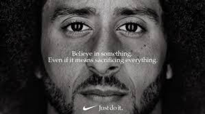
Nike


This ad came early on in the movement, before the text element became primary and the imagery became secondary. We see everything up to par minus the lettering. The font is much smaller than today’s large block letters, and the background image comes in much stronger than the messaging. The background image shows Colin Kaepernick with soft compassionate eyes.
Peloton

Low opacity black and white imagery covered with san serif white type. Here we see a strong black woman that looks like she is celebrating a victory. The text emphasizes the need for decisive action, one of the core tenants of the current movement. The strong background image further supports the strength of the messaging overlaid.
Netflix

Holding true to the bold white block letters centered over an image, Netflix has added a slight sepia tone to its imagery. This adds warmth to the ad and provides visual shorthand for a historical connection to the promoted content.
Fenty Beauty

While FENTY still stayed true to its brand by adding the backward N throughout the message, the aesthetic is still the same, white san-serif block letters centered on black background. Since there is no image underneath, we miss the messaging of compassion that images tend to provide. Instead, it seems to be more of a political statement for the company, reflecting a no-nonsense, minimalist style.
Tik Tok & Spotify


Just like the Fenty statement, Tik Tok and Spotify are adopting a minimalist approach that focuses entirely on the bluntness of the message. The audience again is shown the white block lettering on the black-only background.
Ben and Jerry’s

The ice cream company made headlines from breaking with the trending aesthetic. While the “bold white on black” elements remain, the typography is far more stylized, and the tone of voice is much more confrontational.
This ad is saying its statement while also showing it typographically. However, this approach has not been consistent for the brand, who later released more traditional ad creatives with only a tenuous visual connection to BLM:
