Burger King and GM Refresh Logos to Engage a Changing Audience
New year, new me— that’s exactly what Burger King and General Motors (GM) decided they needed as they kicked off 2021 with refreshed branding. Both brands were very deliberate in how they approached the rebrand, emphasizing new audience trends and preferences (particularly amongst the younger, digital generations, Millennials and Gen Z).
Burger King
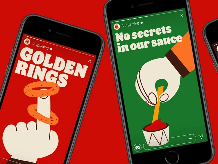
Gone is the shiny plastic burger bun. Burger King’s new logo is two-dimensional and digital-friendly, using more a natural “food-like” color scheme.
“The new minimalist logo seamlessly meets the brand evolution of the times and pays homage to the brand heritage with a refined design that’s confident, simple and fun,” the brand said of the change.
That said, nostalgia has been a dominating trend for Millennials and Gen Z, so it’s not too surprising Burger King is taking a “what’s old is new again” approach to the logo and incorporating design elements dating back as far as 1969.
According to Fernando Machado, global CMO of Restaurant Brands International, the previous logo was not optimized for a digital and mobile-first experience. The new branding palette is inspired by their signature Whopper. With a new font that is retro and easily readable, the new branding plays with childish simplicity that is both inviting and nostalgic.

“Design is one of the most essential tools we have for communicating who we are and what we value, and it plays a vital role in creating desire for our food and maximizing guests’ experience,” said Raphael Abreu, Restaurant Brands International Head of Design. “We wanted to use design to get people to crave our food; its flame-grilling perfection and above all, its taste.”
The beloved stacked burger logo has stood the test of time since 1969. This refresh, a perfect balance of retro and forward-thinking, hit the mark that Burger King was trying to achieve with this logo revamp. And they killed it.
General Motors
Did Adobe come out with a new software service? No? Oh, it’s General Motors’ new logo. Ahead of CES 2021, General Motors unveiled their new, Tron-style circuit-colored logo. The new logo, lowercased gm with the underline only under the ‘m’ in a softened square outline, is inspired by clear blue skies with an all-electric future, according to General Motors global CMO Deborah Wahl.
Katarina Gentry, a graphic designer here at CDA, said of the new logo, “GM is recreating their brand based on what modern audiences want from technology: innovation, electric cars, a focus on the future. This logo looks as much like a software brand as an automotive brand — which is great! It’s clean and bright, and even if the average person misses the ‘electric plug’ motif, it’s still obvious the brand is emphasizing innovation.”
This rebranding shouldn’t come as a surprise to the automotive industry, as news regarding GM’s all-electric Hummer has been circulating since early 2020, and their commitment to 30 new global electric vehicles by 2025.
The last time GM rebranded their logo was back in 1964, so a refresh has been long overdue and the timing of this unveiling couldn’t have come at a better time. With Generation Z (the generation most vocal on environmental issues) finally becoming a major market for new car purchases, GM now stands out as a brand that values environmental impact. It also helps that 73% of Gen Zers surveyed are more willing to pay more for a sustainable brand.
GM hit the bullseye with what Gen Zers look for in a brand: optimistic and full of energy, and tuned in to their core social & political values.